Beyond the day of travel.
Someone at the gate wants two answers: where to go, and whether it’s their turn. In 2020 I proposed that Fly Delta should answer before they had to ask, the way a good concierge stays a step ahead. Delta’s product leadership adopted the idea. I’d been on the original v1 team, and I led creative direction and UX as the app grew into shopping and planning. Over the next four years the idea was tested three times, and customers corrected it twice.
Creative Director & Lead UX Designer
AKQA / Delta · 2019–2024
Before travel

At the gate

On arrival

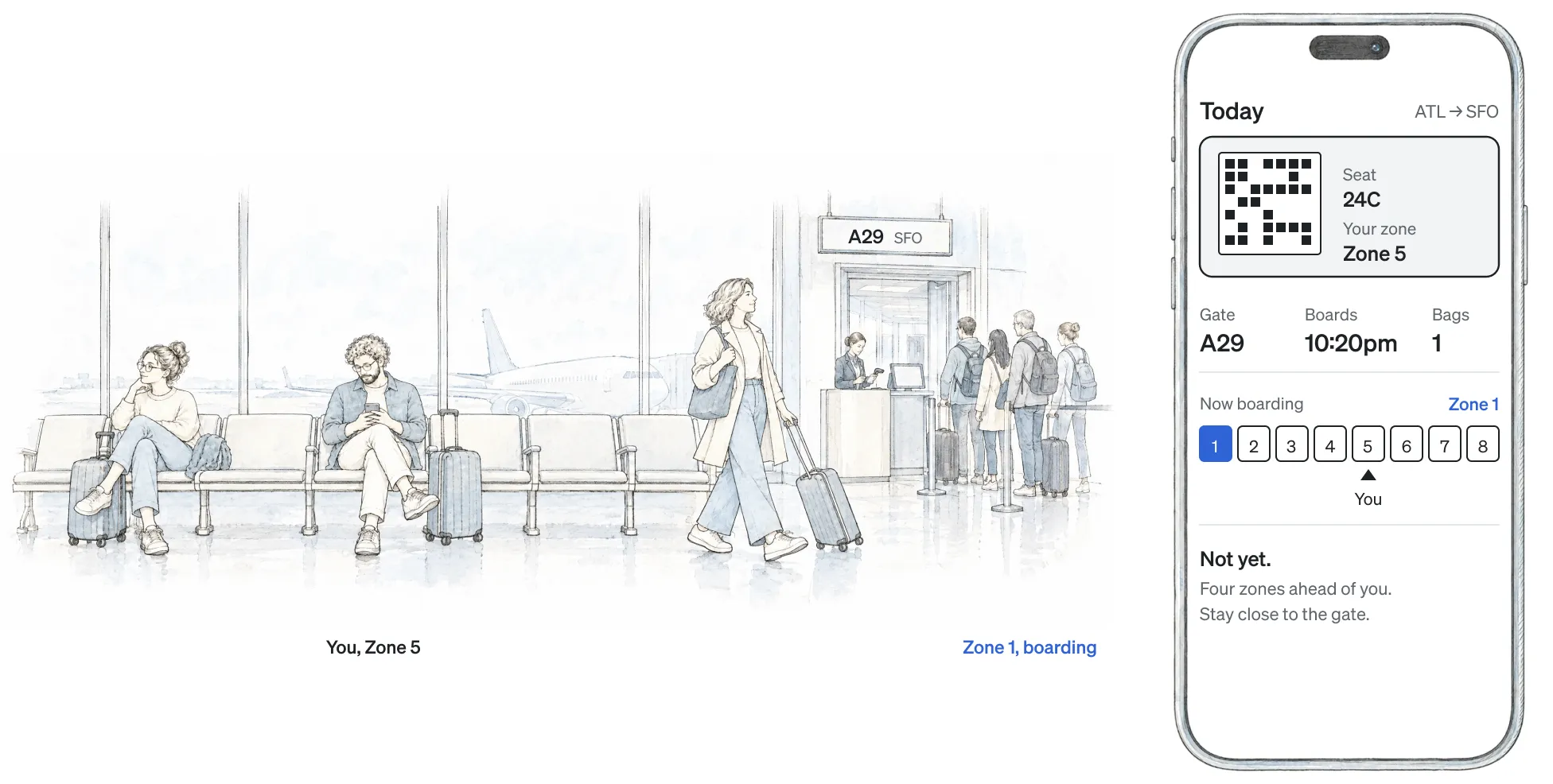
Is it my turn?
I worked alongside four designers to audit the whole app for small moments of guidance that could save someone a trip to another screen. Most of the time the answer was to bring information together rather than add another destination to the navigation.
At the gate, the Today screen put the boarding pass beside the gate, the boarding time and the zone now boarding, with a marker for the customer’s own zone. One glance answered both questions. Before travel and on arrival the information changed while the screen’s job stayed the same. This time, being a step ahead was exactly what people needed.
Let me compare
In shopping, being a step ahead meant I decided the order of choices for people: a flight, then a cabin, with room to explain what each included. I thought a sequence would feel lighter.
I was wrong. Customers wanted to compare times and cabin prices across flights, and the sequence split up exactly the information they were comparing. We moved to a drawer that kept flight and fare together, giving up some room for product detail so people could compare in context.
We watched testing live and prototyped changes between participants, so Delta’s stakeholders saw the problem as it happened.
Flight first, then cabin and bundle

Cabin and bundle beside the flight

Leave my trip where it was
Trips tested it in public. In the 2023 redesign we surrounded a customer’s next trip with destination photography to build excitement. What we gained in inspiration we lost in muscle memory. The familiar ways of reaching a booked trip had changed, and customers said so in public.
A concierge who rearranges your things isn’t helping. In May 2024 My Trips became its own tab, separate from Account, and Explore gave inspiration a place of its own. My work with Delta’s product leadership centered on Explore: recommended destinations, resumed searches and more value from SkyMiles membership. The trip someone had booked and the one they might book next each had a place.
Booked-trip inspiration · 2023

Dedicated Trips · May 2024

Explore · May 2024

It went on without me
By then the idea had a shape: bring information together when people need it, and give different intentions their own space. AKQA reports a billion visits in 2023, a 4.8-star App Store rating and a 10% increase in mobile bookings. Those results belong to the whole app and the work of Delta’s teams.
The result I care about most is Need Help, which another team designed using the concierge idea. It guided their decisions without me in the room to explain it.